Laura S. Marshall
Vegan Bakery App & Responsive Website
2023 / iPhone App & Responsive Website

Roles:
I was the self-directed lead UX/UI designer and researcher for this project. I conducted all user research, wireframing, prototyping, visual design, and testing for this project.
Date:
August – November 2023 (4 months)
Tools:
Figma, Google Workspace
Overview
The problem: A local vegan bakery has no online ordering system and relies solely on an email contact form for order inquiries. Clients get frustrated when they have to wait for email replies and cannot order quickly or easily.
This vegan bakery app and responsive website will allow clients to place their custom and regular orders quickly, efficiently, and confidently.
User Research
Summary: To understand the problem, I conducted user interviews, created empathy maps, and built user personas to guide my design. My research revealed that customers were quite frustrated by the bakery’s lack of online ordering and needed to be able to communicate their customization selections easily while also sometimes requesting to avoid certain ingredients such as common allergens.
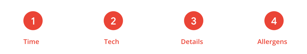
- Pain Point: Time
Busy people can’t afford to wait a day or two for an order confirmation. - Pain Point: Tech
Email is not the most efficient or reliable way to take orders. People are used to ordering online nowadays and appreciate the convenience. - Pain Point: Details
With a simple email contact form, clients might forget to include details, requiring the baker to reach out and ask, which delays the process further. - Pain Point: Allergens
People with food allergies want to feel confident that they will not be exposed to the allergens they must avoid.
User persona: During the empathize phase of the process, a user persona arose. This target persona, based on my research, informed my design choices and made my product more useful.
Daisy, 23, is a design firm intern who needs a quick, easy way to place and pay for orders at the vegan bakery because they’re busy but want to impress their bosses by being inclusive of vegan coworkers.
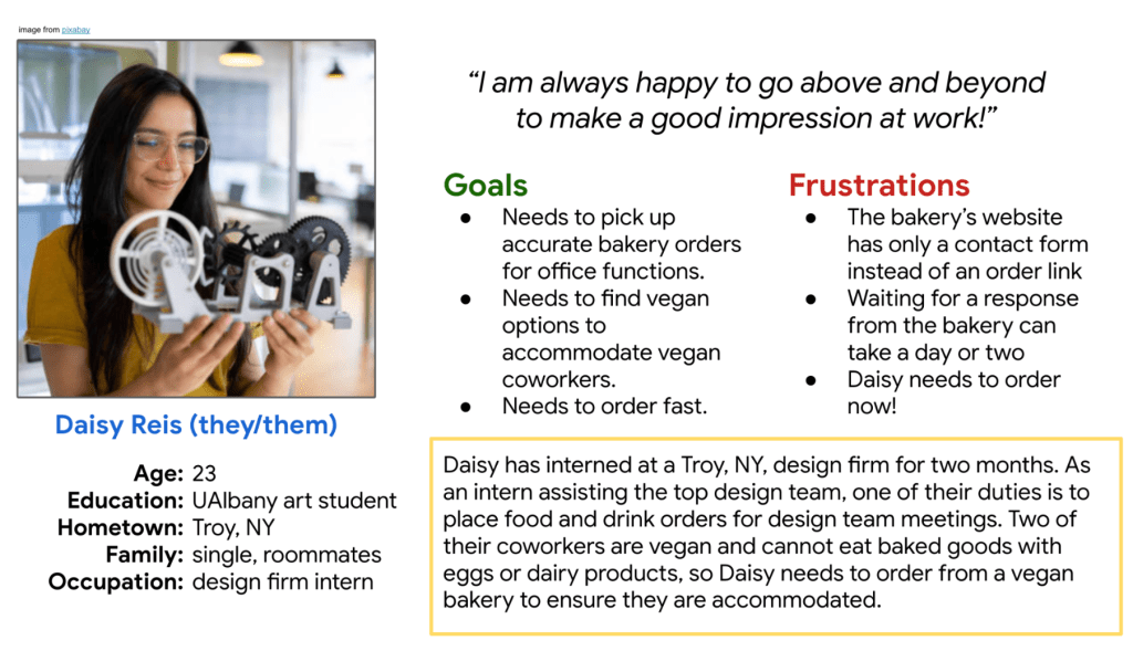
Mapping Daisy’s user journey helped me to see how important it would be to enable in-app ordering and payment for this local vegan bakery.

Several must-have features emerged during this phase:
- In-app or online ordering
- Payment at the time of order placement
- Order tracking
- Clear, easy-to-read text and eye-catching images
Ideation and Design: App
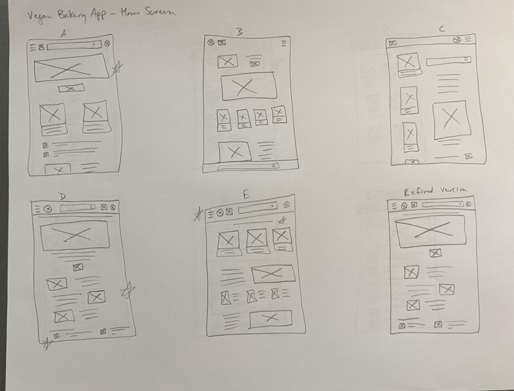
Paper wireframes: I wanted to give users the things they would need: a simple, clear header with the bakery logo, a nav menu, a search bar, and account button; featured product(s); an order now button, a link to the full menu, and reviews from a few customers. You’ll see these elements in the Refined Version (lower right).
Digital wireframes: This is the digital wireframe for the vegan bakery app’s home screen, designed for clarity and based on user research that showed users want to be able to access the full menu of items quickly and easily.

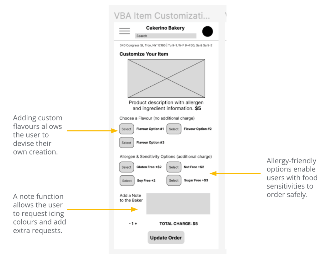
User research showed that customers at this vegan bakery wanted to customize orders for flavour as well as allergen avoidance. A customization screen enables users to filter out allergens and feel confident about their requests.
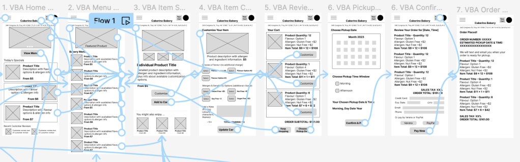
Low-fidelity prototype: My low-fidelity prototype followed the user flow through placing a custom order, creating and logging into an account, and learning more about the bakery, so that users could test the product’s usability. View the app’s lo-fi prototype here.
Usability Study: App
Once we had a lo-fi prototype, we needed to find out whether it was easy enough to search for, view, download information about, and review a trail on the app. We hoped to understand the specific challenges users may encounter in the search, download, and posting processes, so that we could fix those issues before launch.
Research questions:
- How long does it take to place an order in the app?
- What steps do users take in placing an order?
- What frustrations do users encounter in the app?
- How often do users place an order in the app?
- How much time, on average, do users spend in placing an order?
Methodology and participants: This was an unmoderated usability study, held remotely; each of the five participants went through the test on their own at home. Each session lasted 60 minutes and included an introduction, a list of tasks, and a brief questionnaire.
Participants were all residents of the Capital District in upstate New York who are vegan adults. They were chosen from a screening survey given to members of a local vegan Facebook group. As an incentive, we gave each a $20 gift card to a local vegan eatery. The participants were two females, one male, and two nonbinary individuals, all between the ages of 20 and 75. One participant had limited technical literacy.
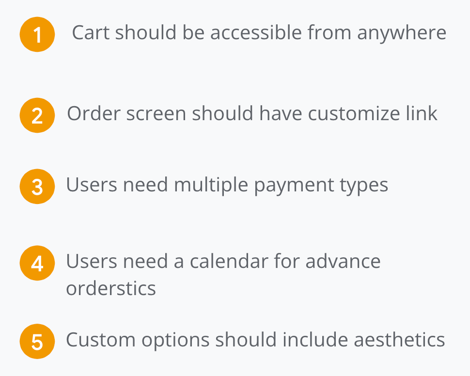
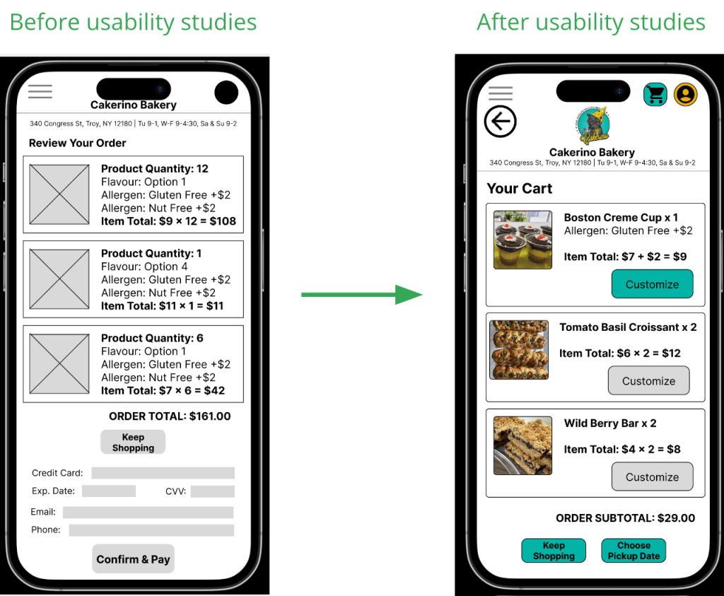
Observing users showed that the app could use the following fixes:
Mockups: App
Low-fidelity mockups
The initial prototype had
no way for users to find their cart from any screen, including the home screen. We added a cart button in the upper right of every screen for easy access.
In the first version, there was no way to customize an item from the Review Your Order screen without tapping the item, which was not intuitive for all users. We added a Customize option to each item on the order screen.
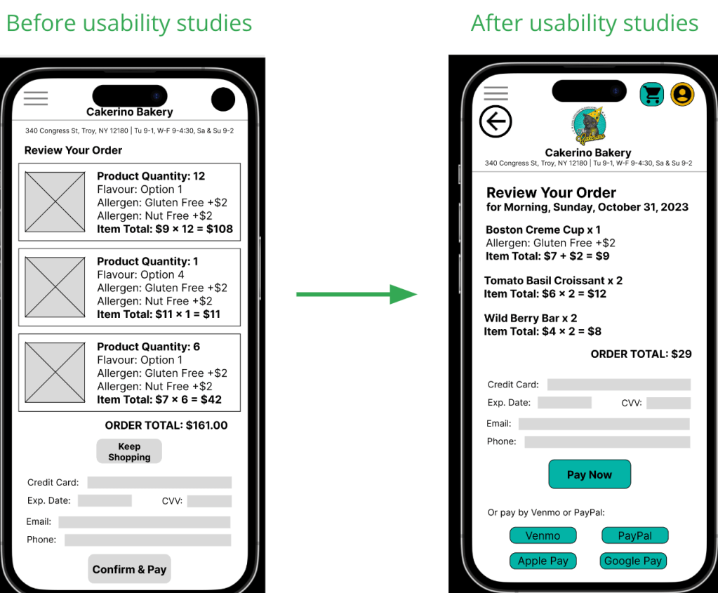
Some users were hesitant to enter credit card information direction into the app, so we included additional payment method options (Venmo, PayPal).
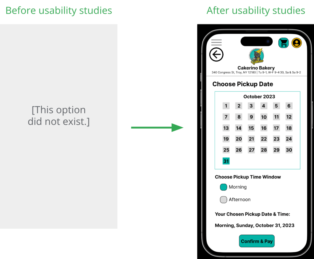
To allow advance orders, we added a way for users to choose a pickup date and timeframe.
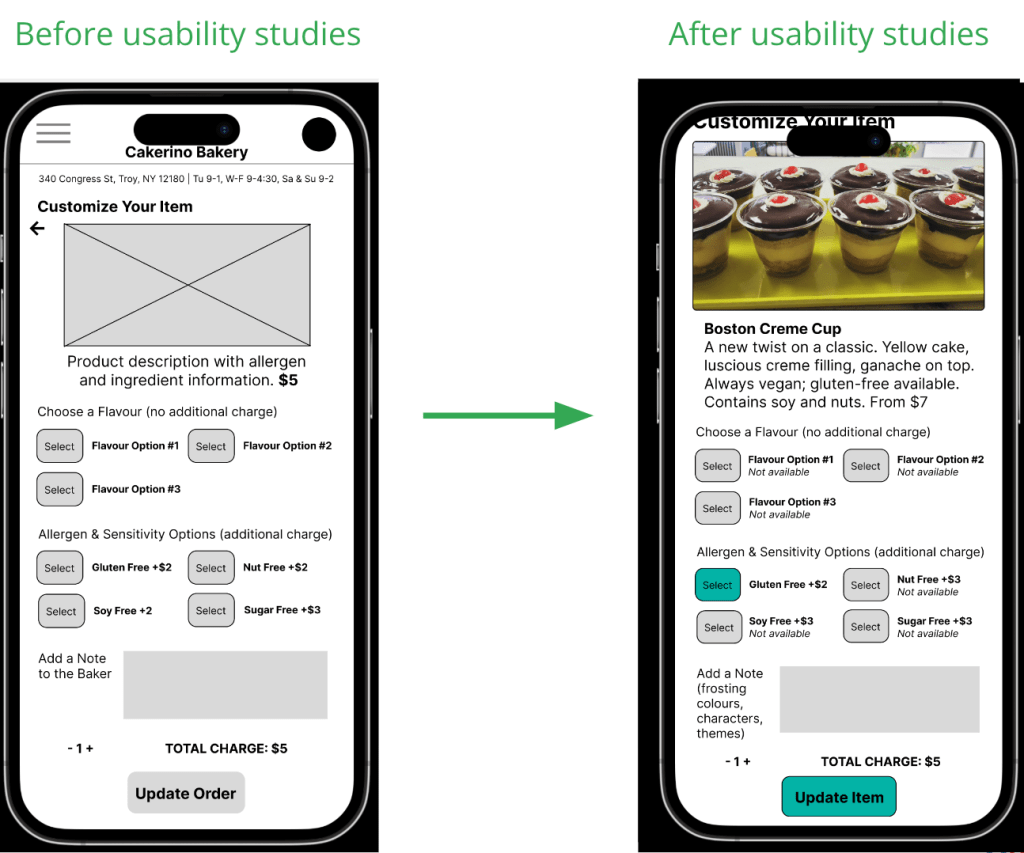
For greater customization, we added a way for users to communicate aesthetic preferences such as frosting colours or decorations.
Prototyping: App

High-fidelity prototype: My high-fidelity prototype followed the user flow through placing a custom order, creating and logging into an account, and learning more about the bakery, so that users could test the product’s usability. View the app’s high-fidelity prototype here.
More usability testing
In a second round of our usability study, we found that users wanted more clarity in the customization screen and even more payment options.

Accessibility considerations:
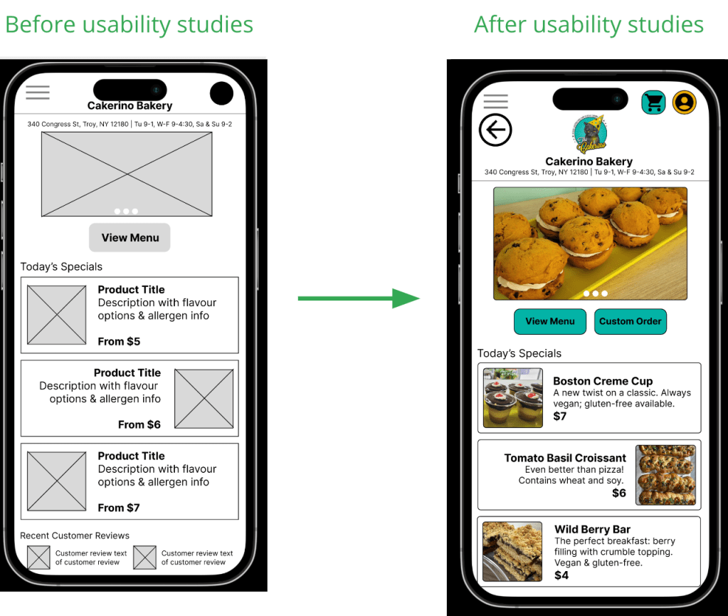
- For easier viewing, I chose to use high-contrast colours like black, white, grey, teal, and gold. I checked accessible-colors.com to ensure the combinations were accessible for all viewers.
- For ease of use, I made all call-to-action buttons bright teal so users will know they need to click there. Deselected or unavailable options are greyed out.
- For linguistic accessibility, I made the button text as simple and clear as possible. Users with various linguistic backgrounds can now follow the instructions and use the app.
Takeaways
Impact: This app allows users to order custom or allergen-free baked goods from the vegan bakery quickly and conveniently from their phones.
One research study participant commented, “I would use this app a lot to get baked goods, now that I know I can customize them to be gluten free!”
Another shared, “This will really save time when I want to order goodies for work.”
What I learned: This project showed me how small changes in a product’s design can have a big impact on the user’s experience of the app – and on their perception of the brand, too. Working with feedback from usability studies helped me make the app simpler and more accessible.
Next steps

Responsive Website
Once the app had been through two rounds of usability testing, I used the design philosophy of progressive enhancement to expand the mobile app into a responsive website that could be viewed and used across devices: desktop or laptop computer, tablet, and mobile phone.


Low-fidelity prototype: The lo-fi prototype followed the user flow through placing an order, so that users could test the product’s usability on different devices. The site is responsive and changes based on the user’s device. View the vegan bakery’s website lo-fi prototype here.

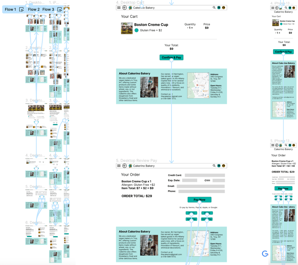
High-fidelity prototype: The hi-fi prototype followed the user through placing an order, from viewing the menu and selecting an item through payment and confirmation, so users could test the site’s usability. View the vegan bakery website’s high-fidelity prototype here.
Thoughts
Everybody enjoys a treat now and then. Even vegans! And placing an order at your favorite bakery doesn’t have to be difficult — technology can make ordering quick, easy, and convenient for everyone, from busy parents to stressed-out interns. This in turn will make order processing easier for the bakery owner, who now will not have to reply to emails and wait for additional replies or confirmations. With the click of a few buttons, orders can be finalized and paid in advance.
This project was based on human-centered research. My users showed me that the email contact form process on the bakery’s website was slow, drawn-out, and inefficient, and that it introduced unnecessary delays and stressors into what should be a quick transaction. I decided to build a solution that would make the ordering process as simple as possible, while allowing customers to place custom orders for allergen-free items or special-occasion indulgences.
